Redesigning Healthcare Access
Audit and Redesign of Public Healthcare for Equity & Autonomy
- Role
- UX/UI DesignerUX Researcher
- Timeline
- 6 weeks
- Tools
- FigmaFigjam
Audit & Redesign · 2025
Usability failures in public healthcare push digital demand back to registration desks. When patients can't register, reschedule, or pay on their own, the cost lands on staff.
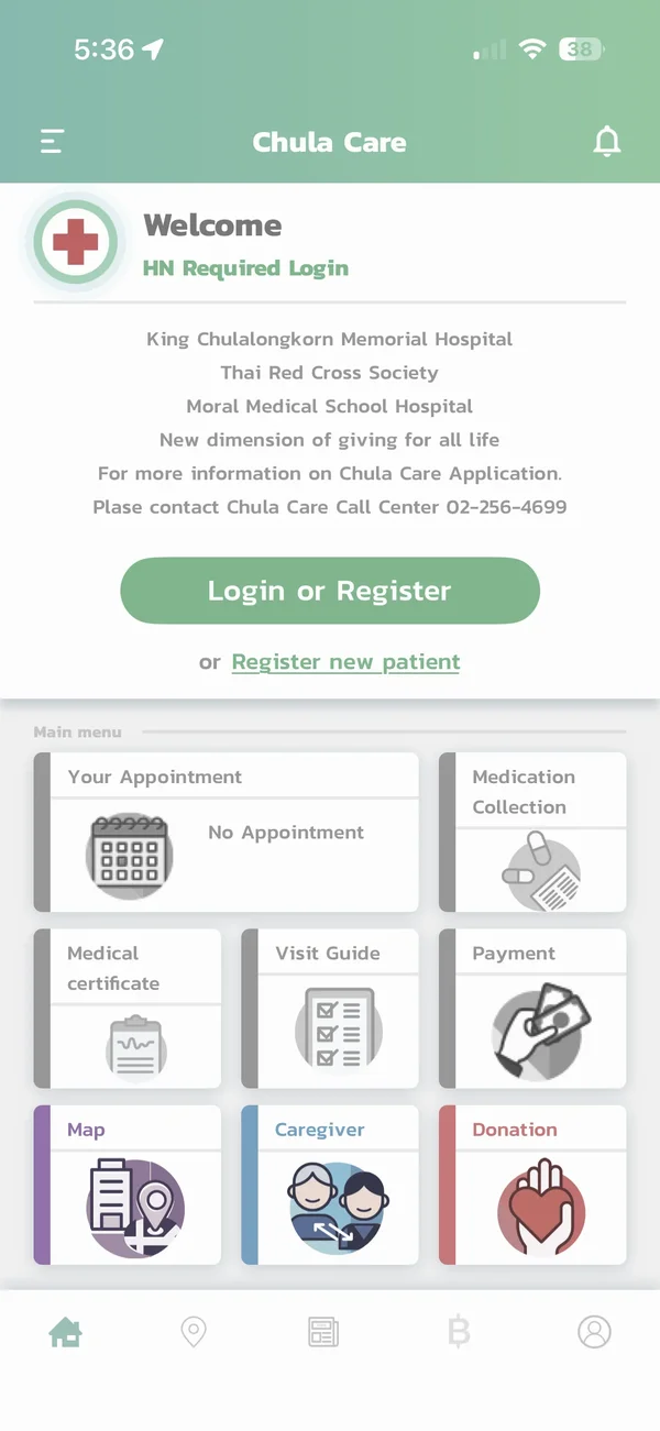
Recurring themes from 2019–2024 reviews on Google Play and the App Store.
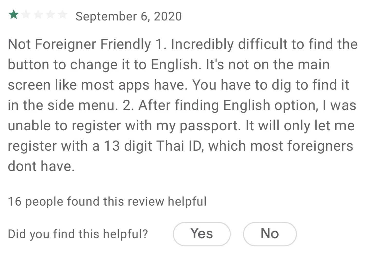
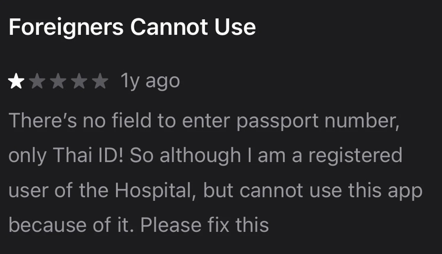

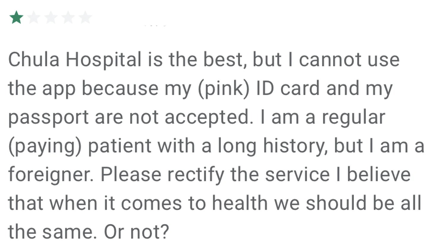
Identity access failures
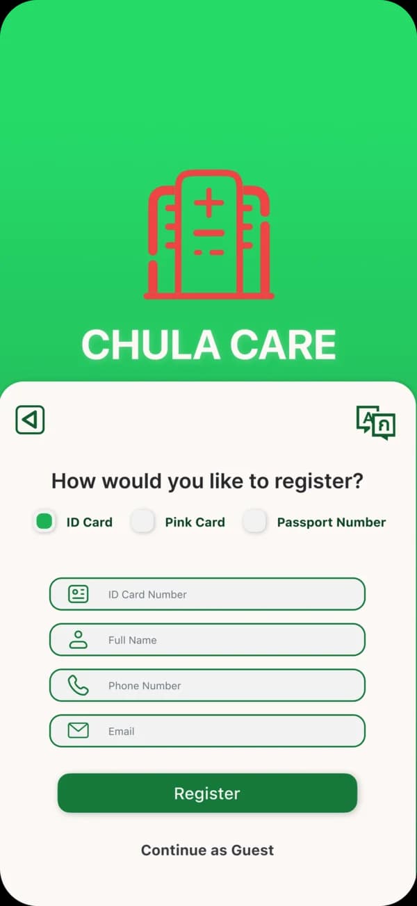
Registration assumes Thai National ID, blocking patients with valid hospital numbers.
Cognitive overload
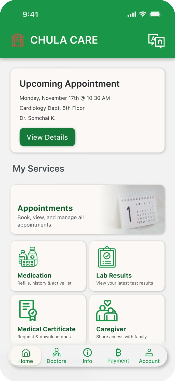
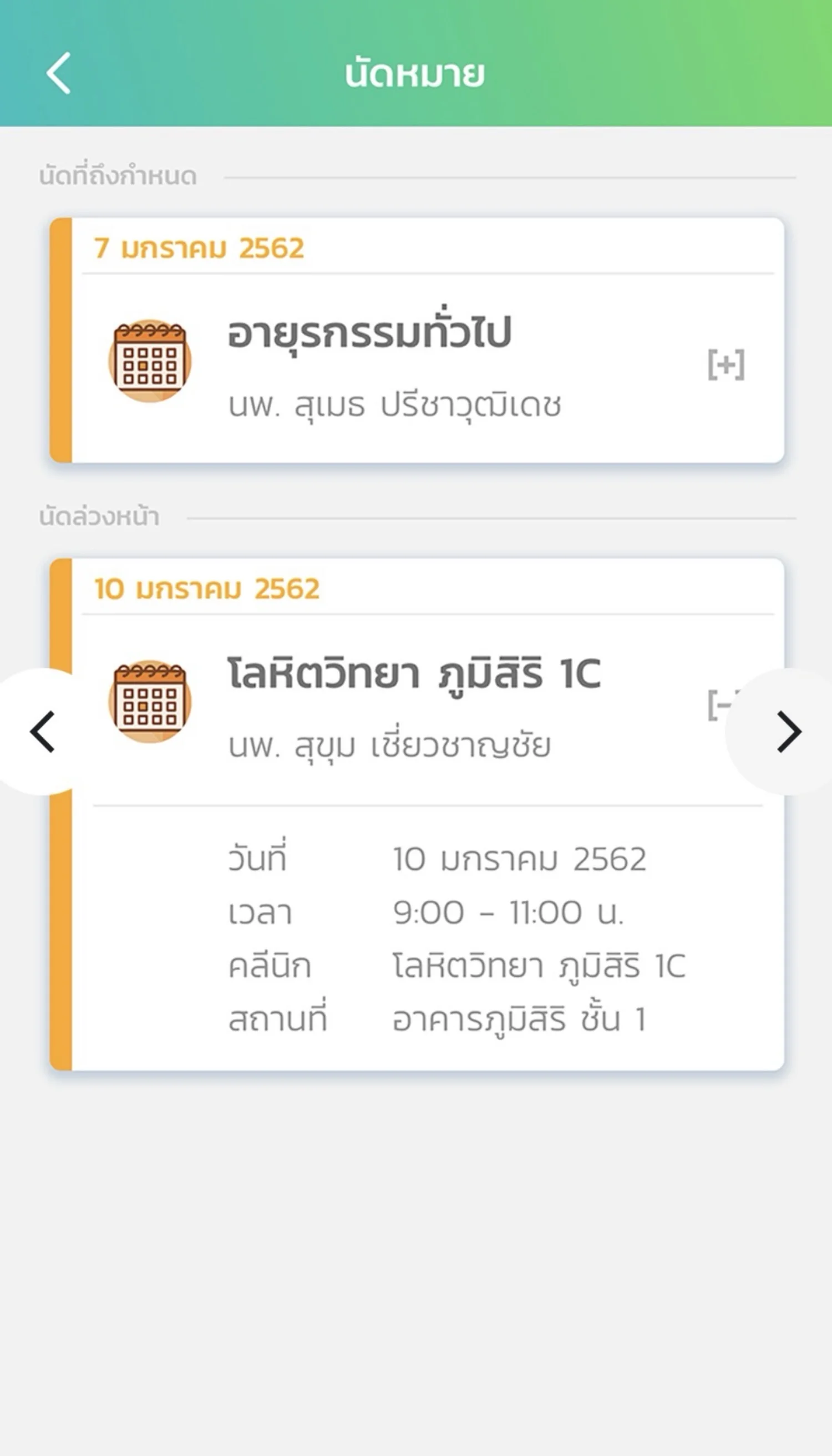
Dense home screens force scanning and decision-making during high-stress visits.
Accessibility gaps
Keyboard navigation, touch targets, and focus states fail WCAG requirements in critical flows.

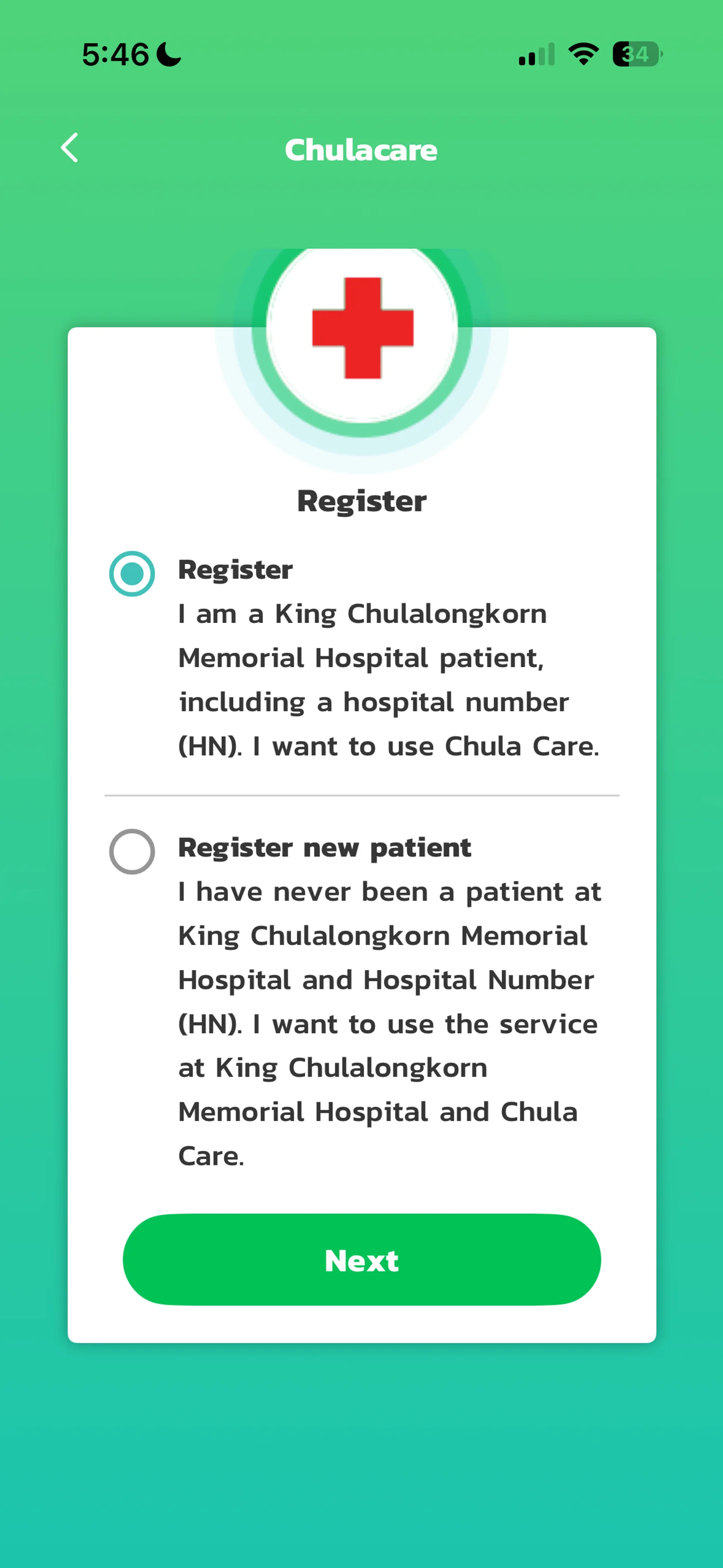
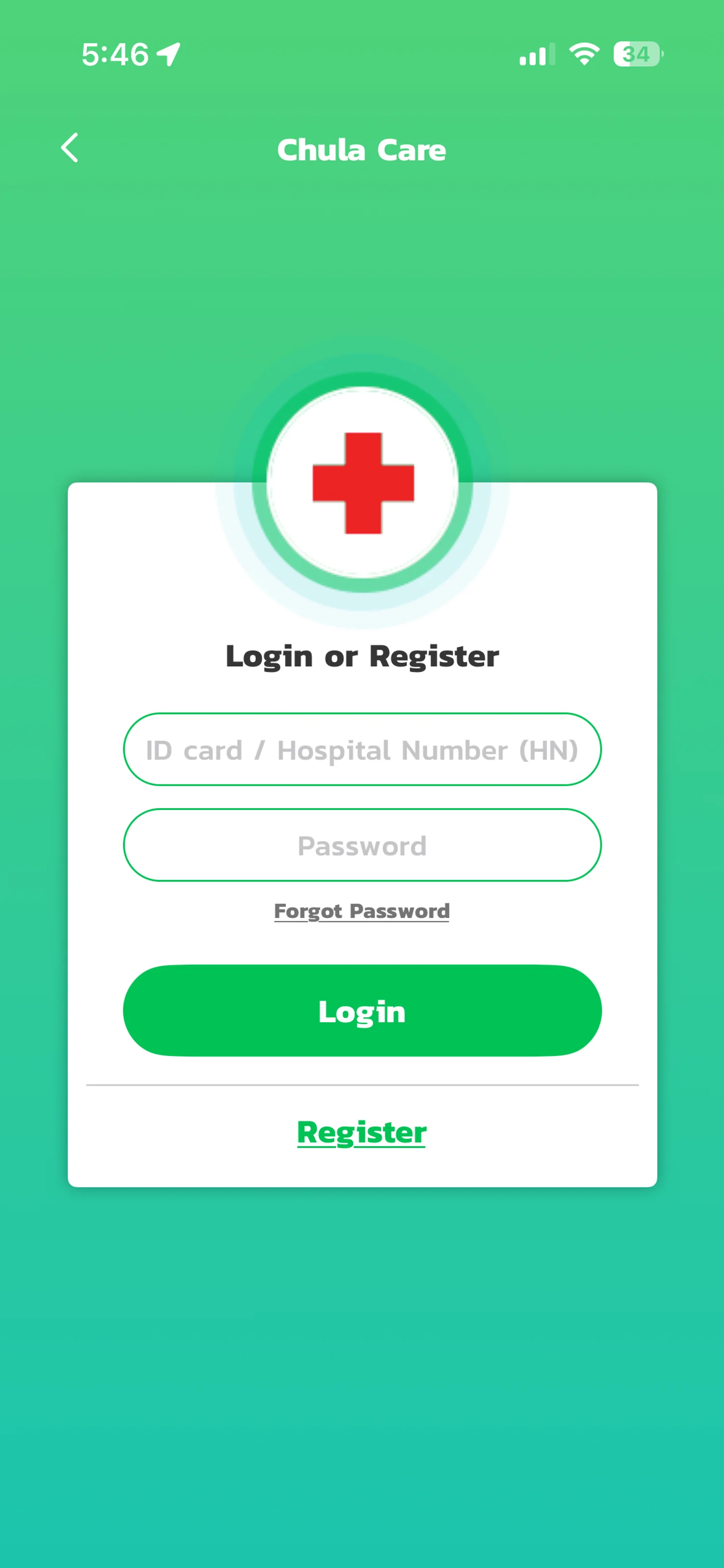
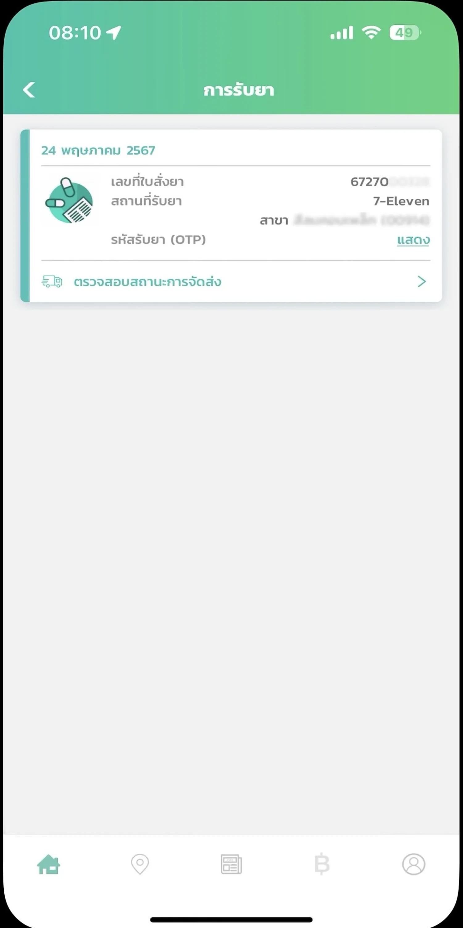
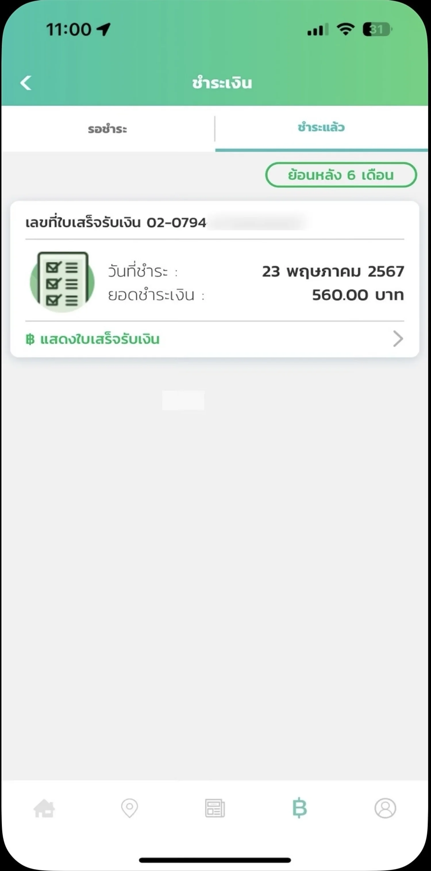
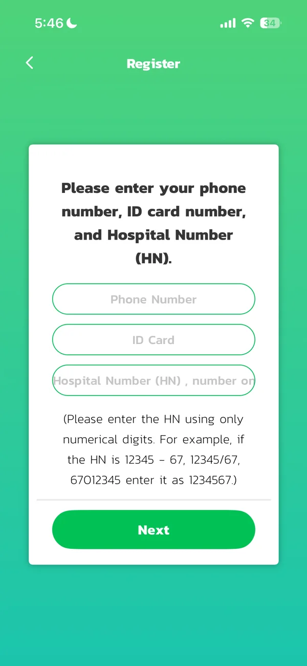
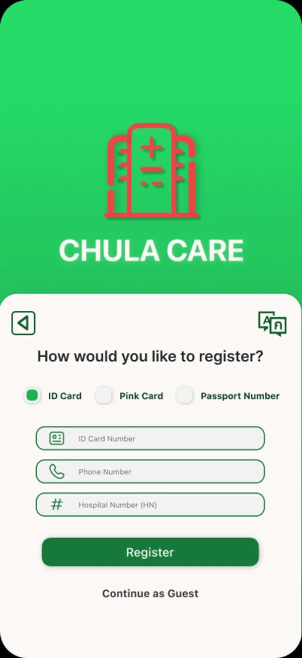
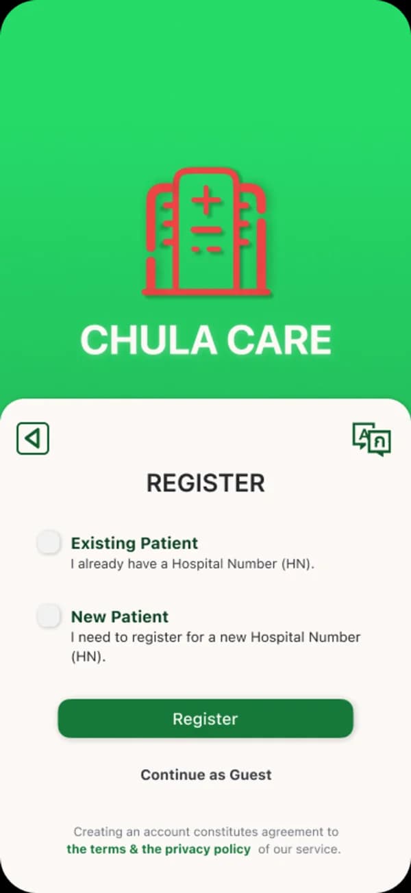
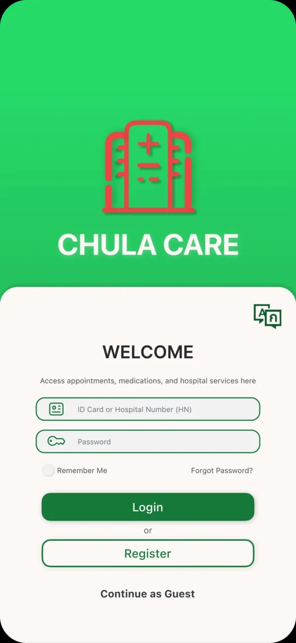
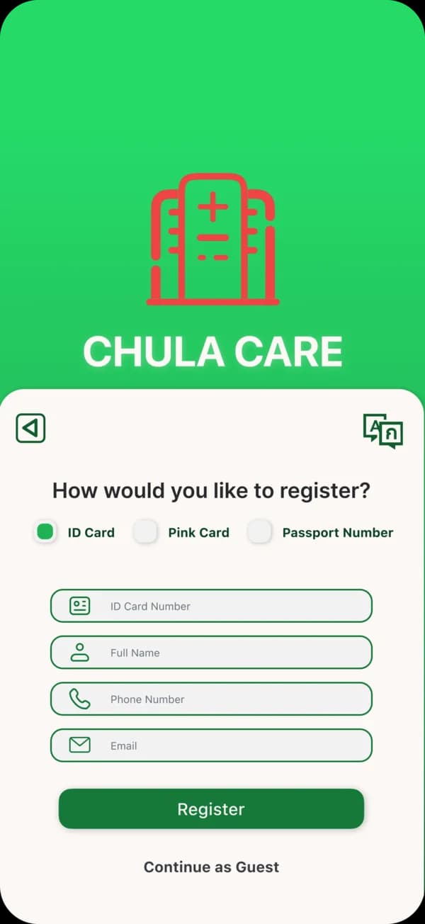
A single ID requirement was blocking patients with valid hospital numbers. The redesign opens three entry paths so access doesn't depend on document type.
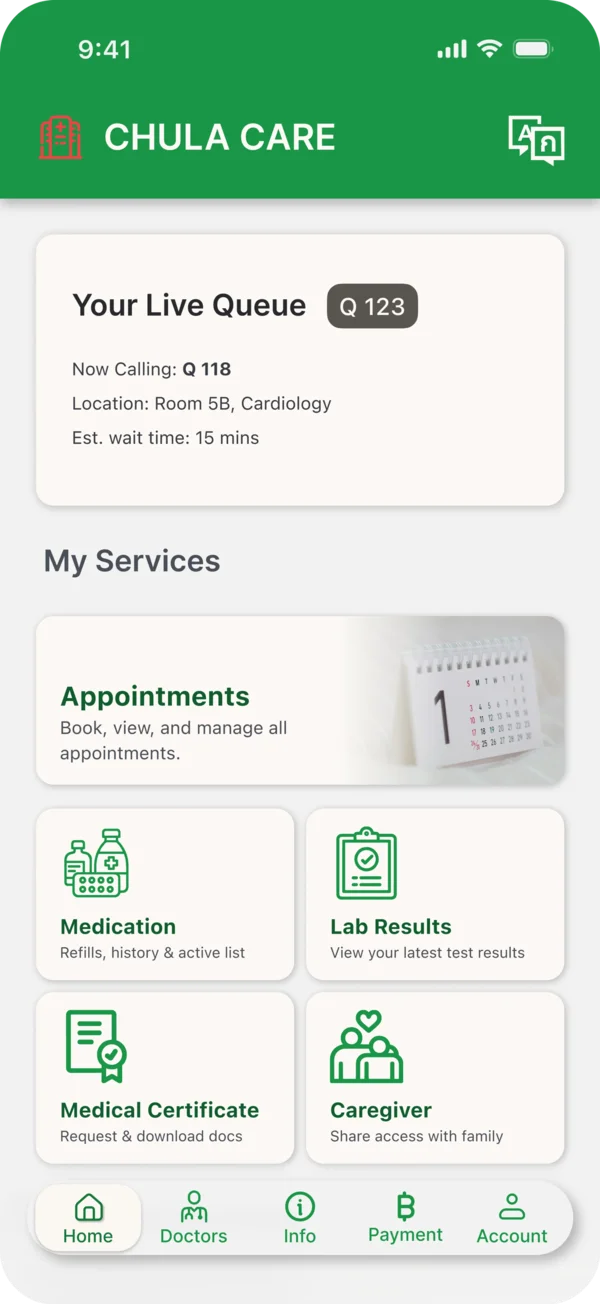
The home screen prioritizes live queues and upcoming appointments to reduce decision-making during time-critical visits.
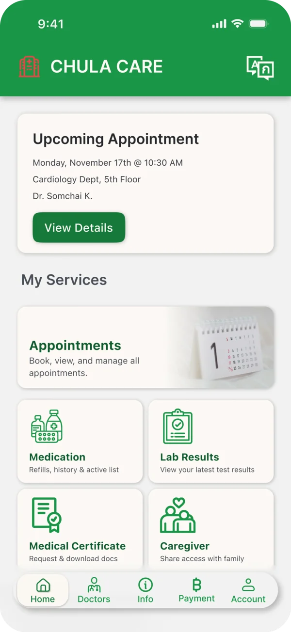
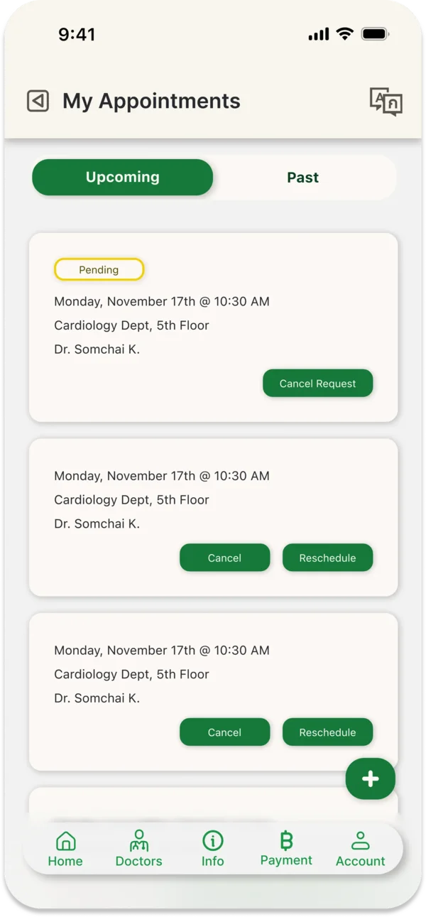
Patients can view, reschedule, or cancel appointments directly without staff intervention.
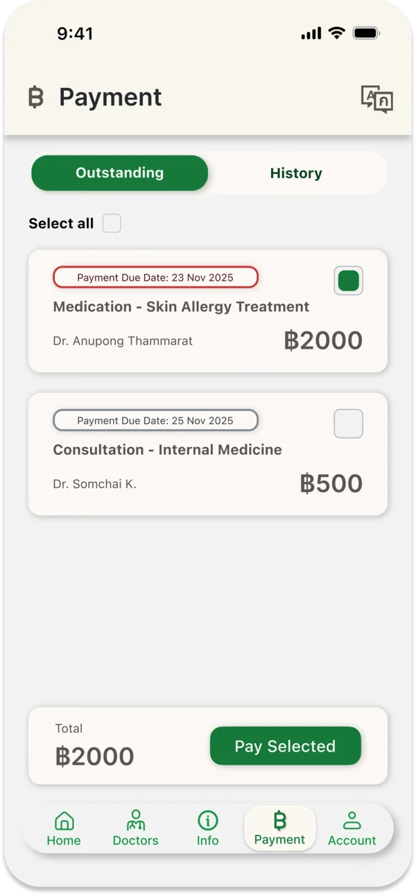
Self-service billing and visit actions reduce dependency on physical registration desks during hospital visits.
1. Focus Visibility
(WCAG 2.4.7)
Custom high-contrast focus states replace default browser styles, ensuring predictable keyboard navigation through the form.
2. Target Size
(WCAG 2.5.5)
All interactive elements meet the 44x44px minimum, reducing missed taps for users with limited motor control.
3. Name, Role, Value
(WCAG 4.1.2)
Semantic HTML and ARIA live regions ensure labels, roles, and validation errors are announced clearly by screen readers.
The prototype was tested end-to-end under keyboard and screen reader use, confirming that accessibility fixes held up across the full registration flow.
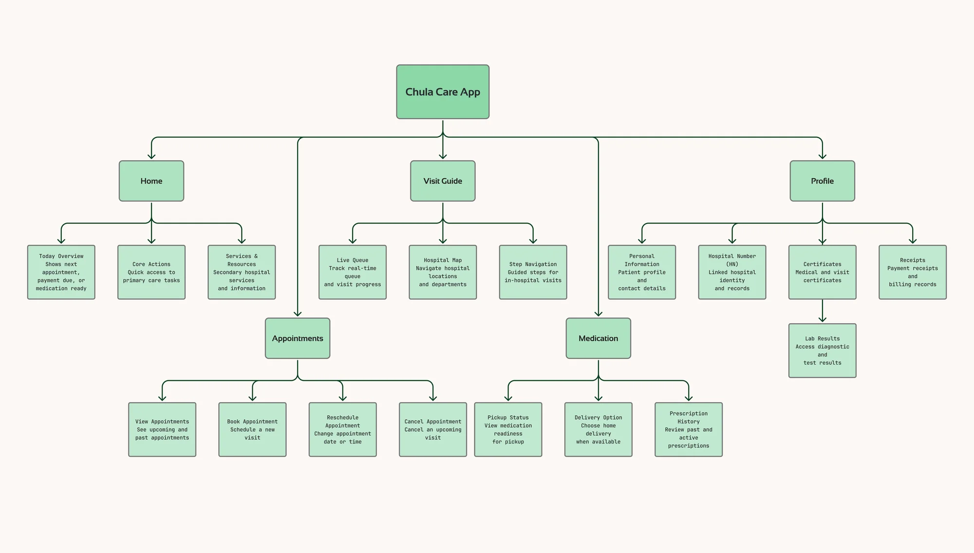
Navigation was restructured around how patients actually move through the hospital: arrival, queue, consult, payment, pharmacy. Each step reachable without backtracking.
Expected operational impact
Onboarding completion
↑ Improve
For foreign patients using Hospital Number verification.
Pharmacy counter visits
↓ Reduced
Through clearer medication fulfillment tracking.
Login & registration support calls
↓ Fewer
By removing identity barriers.
Self-service appointment changes
↑ Increased
Reducing demand on physical scheduling desks.
SUS accessibility score
↑ Higher
Following WCAG 2.2 remediation.
Disclaimer
This is an independent concept redesign created for portfolio purposes only. I am not affiliated with King Chulalongkorn Memorial Hospital or the Thai Red Cross Society.