Executive Analytics for SaaS Growth
For SaaS leadership teams who live across too many tools
View landing page- Role
- Product Designer
- Timeline
- 8 weeks
- Tools
- Figma

Project · 2025
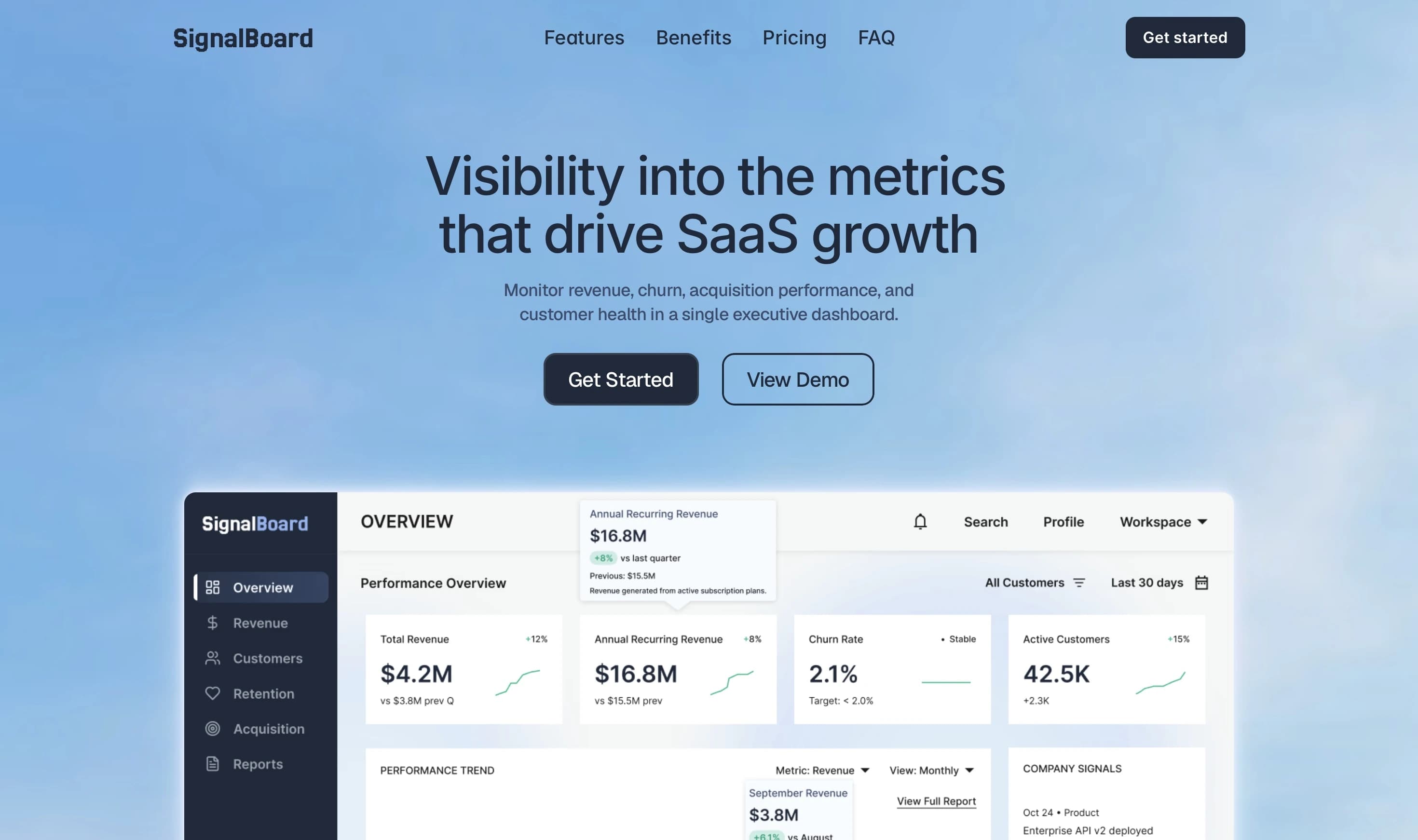
SignalBoard is a B2B SaaS analytics platform designed for executive teams. It consolidates revenue, customer growth, retention, and acquisition performance into a unified dashboard. The system replaces fragmented reporting with a single view leadership can actually act on.
↑ Faster Decisions
Leadership gets the full picture in one view instead of waiting for someone to compile a report.
↓ Less Context Switching
Revenue, retention, and acquisition data in one place means fewer tabs, fewer exports, fewer handoffs.
↑ Earlier Risk Visibility
Churn and revenue exposure sit on the same screen, so at-risk accounts surface before they become lost accounts.
Revenue lives in one tool, retention in another, acquisition in a third. By the time leadership has the full picture, the context has already shifted.
The challenge wasn't visualization, it was grouping. Executives think in questions, not metrics. The dashboard structure follows those questions: what is revenue doing, where is retention weakening, what is slowing growth.
Decision Speed
Leadership gets the full picture the moment they open the dashboard. No waiting for a report, no piecing together data from separate tools.
Reduce Cognitive Load
Each view is scoped to one business question. Revenue, retention, and acquisition are separated so teams can focus without switching context.
Data That Speaks For Itself
Charts and metrics are structured so trends and risks are visible at a glance. No training required to read the dashboard.
Each page is structured into three layers: high-priority KPI summaries at the top, one dominant trend visualization, and supporting details below. Fast to scan at a glance, deeper when you need it.

Labels stay small and muted so the number dominates at a glance.
Opacity encodes data weight so patterns are visible without reading every cell.
Single hue with no legend. Color carries no categorical meaning here, only the number does.
Metric switching, view toggles, and contextual tables tied to chart data make the product feel dynamic without overwhelming executive users. The dashboard reads differently every morning because the business does too.
KPI tiles stay fixed at the top so headline numbers are always in view. The chart below is the only thing that changes when you switch metrics, keeping context stable while the data shifts.
Churn and growth sit on the same screen deliberately. Seeing them together forces the question the dashboard is designed to answer: are we acquiring faster than we're losing?
Churn rate alone doesn't tell you enough. The cohort view was added so teams can see whether retention is improving over time, not just what it is today.
CAC, conversion rate, and sales cycle length are shown together because they answer the same question: where is growth slowing down and why.