Operating System for Modern Skyscrapers
Real-time Control for Modern Buildings
View landing page- Role
- Product Designer
- Timeline
- 6 weeks
- Tools
- Figma
Project · 2025
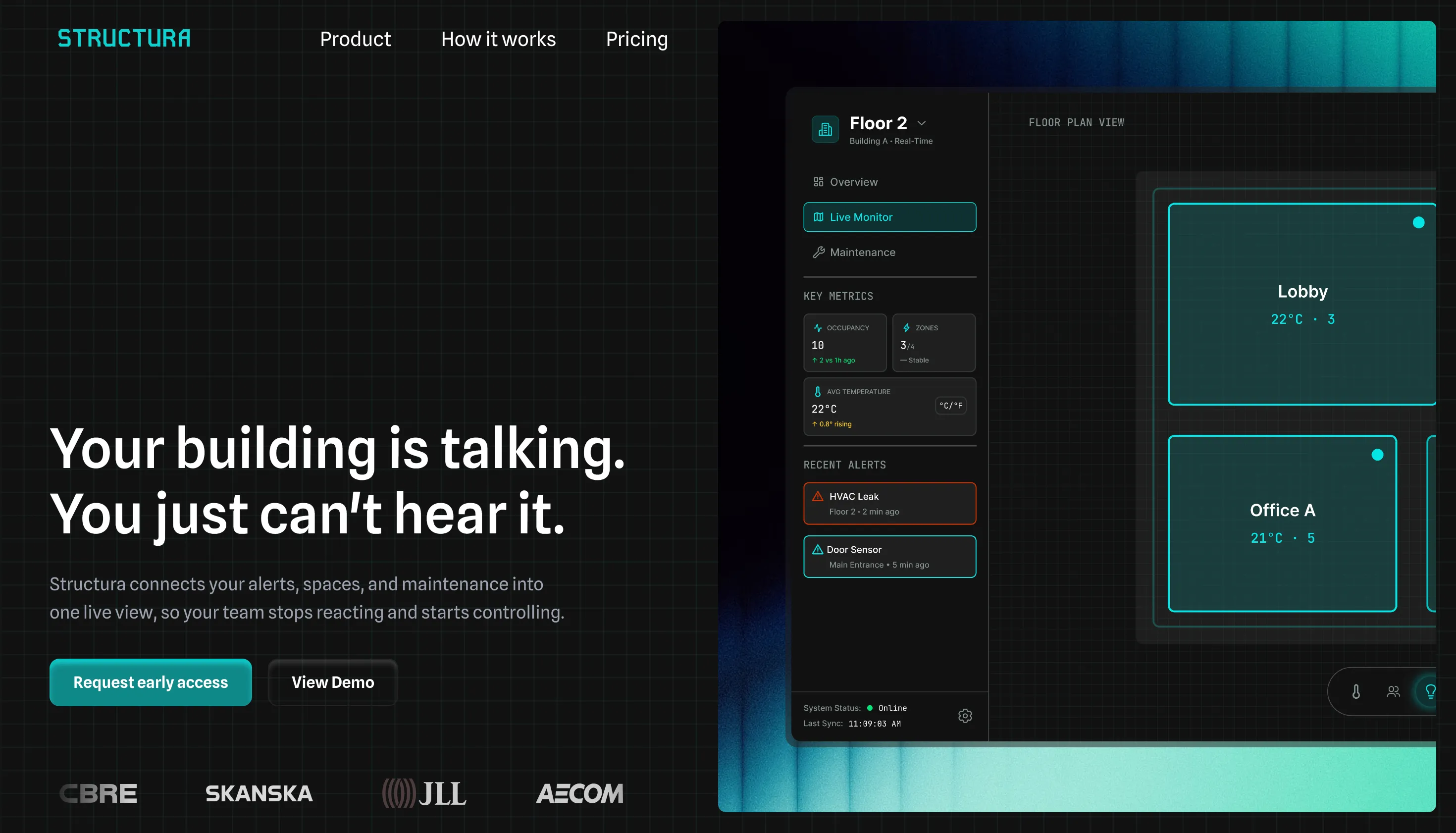
Facility teams have no single view of what's happening. Structura connects alerts, spaces, and maintenance in one place.
It is a "Digital Twin" dashboard that aggregates data from IoT sensors (temperature, occupancy, security) into a visual interface, allowing managers to monitor efficiency and resolve issues proactively.
Impact estimates are based on industry benchmarks and comparable enterprise facilities platforms
Faster Issue Resolution
~25%
Linking alerts directly to spatial context and sensor metadata reduces investigation time and eliminates redundant site visits.
Lower energy costs
~12%
Real-time occupancy and system overlays enable automatic reduction of HVAC and lighting in unused zones.
Faster onboarding
~40%
Familiar SaaS patterns and consistent color semantics reduce operational errors and shorten onboarding time for new engineers.
Enterprise building tools face a density tradeoff. Legacy systems overwhelm users with complexity, while modern SaaS dashboards strip out the granular data needed for diagnosis.
Facility teams need to compare multiple signals at once: every extra click in a diagnostic workflow is a delay. The direction was higher density with persistent contextual data visible at all times, not hidden behind progressive disclosure.

Semantic color
Cyan, amber, and green encode system state across every screen. The interface communicates urgency before a word is read.
Density over whitespace
High density with a dark background keeps operators in context during long shifts. Contrast and hierarchy replace whitespace as the tool for managing visual load.
The overview screen answers the first question every operator asks when they start a shift:
is anything wrong right now?

Once an operator knows something is wrong, the next question is where. 2D floor plans with layered overlays for temperature, occupancy, and energy answer that in one look. No rotation, no re-orientation. Built for tablet use on-site, with touch targets sized for the field, not a desk.
Locating an issue and knowing what is being done about it are two different questions. The maintenance view organizes work by status so teams can see what is new, what is in progress, and what is resolved without a standup. Nothing critical should require an extra click to surface.